Streamlining a complex PDF editor into an intuitive cross-platform experience
Soda PDF
Fully-featured Adobe Acrobat alternative
Soda PDF is a SaaS that enables users view, create, and edit Portable Document Format files. It was originally developed as a standalone application by LULU Software (now Avanquest) in 2010, Montreal, Canada.

Project impact
Three months after the release of Soda Online, the team was happy to observe
41%
less UI-related complaints received by the support department
4.2
rating on TrustPilot, an excellent increase over the previous 3.3
18%
improvement in user conversion from trial to paid accounts
Background
Soda PDF first started as a one-time purchase standalone desktop software. Later, the company switched to a SaaS model. “Service pages” offering an easy and convenient way to accomplish popular PDF-related functions were added to the website, doubling as landers for both organic and paid traffic. A limited online editor was also introduced, with an UI based on the desktop program.
Interface-wise, early versions of Soda PDF mimicked the feel of Microsoft Office at the time. Then, starting with version 12, the software was redesigned to have its own more distinct style. However, with lack of a fleshed out design system and many new features being added over time, inconsistencies in the UI started to appear.

Soda 10

Soda 12
I joined the Soda PDF product team at the time when version 14 was being developed. My mandate was to help make the user experience more coherent by tweaking to some of the flows, wording and visual presentation.

Soda 14

Soda Online
After the successful lunch of Soda 14, based on fresh user feedback, the company developed a clear roadmap for major upcoming features. A plan was formulated to shift Soda PDF from a primarily desktop application, to a fully featured online editor that would work seamlessly across devices.
We needed to create a new, online-first vision of Soda PDF. That version would initially be released with only the main, most commonly used features. The reminder of the old functions, as well as the planned new ones, would be prioritized and then deployed as development time allowed. When feature parity was reached with the desktop application, the online variant would be packaged as a replacement for the standalone desktop version of the software.
I had the pleasure and responsibility to take point on the Soda Online design.
Challenges
- the new version of the app had to seamlessly bridge the desktop, mobile and web experience
- we needed to stay sufficiently consistent with the mental model existing users had
- the extensive amount of features in Soda PDF added a lot of complexity to the project
- due to incomplete in-app tracking, there was a lack of precise feature-usage statistics
- public perception of Soda PDF needed to be improved, with the Trustpilot score set as the main metric
Role and process
My first step was to completely immerse myself in the software, using and getting familiar with its every aspect. During that process I also quizzed around about some of the more obscure functionality, how and why we came to have it.
I then tested competing offering from Adobe, Wondershare, Nitro, Foxit and others, and looked at the feedback they were receiving online. I spoke with team members about how they saw the differences between us and the competition - what they thought we did better and where we were behind.
My next step was to build an image of how the world perceived our current app. First, I examined online reviews and rating sites like Trustpilot and G2. I then proceeded with aggregating data from support tickets and interviewing members of our support department about their interactions with our users. AI tools, ChatGPT being premier at the time, helped greatly in parsing and summarizing the information.
Following that, I conducted a card sort with our internal cross-department test group, to see how we could improve the information architecture in the app. In addition to sorting the features into groups according to how they thought the features belonged, I asked them to also mark which features they used the most, and which, if any, they hadn't realized we offered.
With that knowledge, I could start work on the design. Here are some of the highlights.
Upgrading and unifying the layout
Due to its iterative development but lack of design system at the time, Soda PDF was somewhat inconsistent in its interface. This was most noticeable when it came to where certain features were located and how the menus and dialogues they opened would appeared. Based on the accumulated feedback and the long-term vision for the product, I set to create a coherent layout that better allowed for the product's growth and integration with the rest of the Avanquest ecosystem.
After going through a series of options, we reached a variant the team agreed on.

Soda Online layout on desktop, laptop and tablet
The leftmost side of the screen was reserved for major service categories, helping improve their visibility and ease of access.
The "system zone" at the top became home to account, search and other top-level functions that carried across from service to service.
The "tools area" and "side panel" zones would house elements that changed depending on the task the user was preforming.
With the updates to the information architecture and the more airy direction of the UI's redesign helping turn the user's document into the real hero, we could provide a more consistent and pleasing experience.
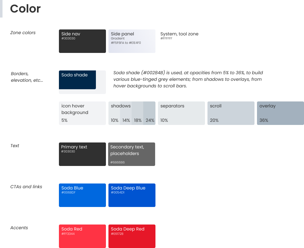
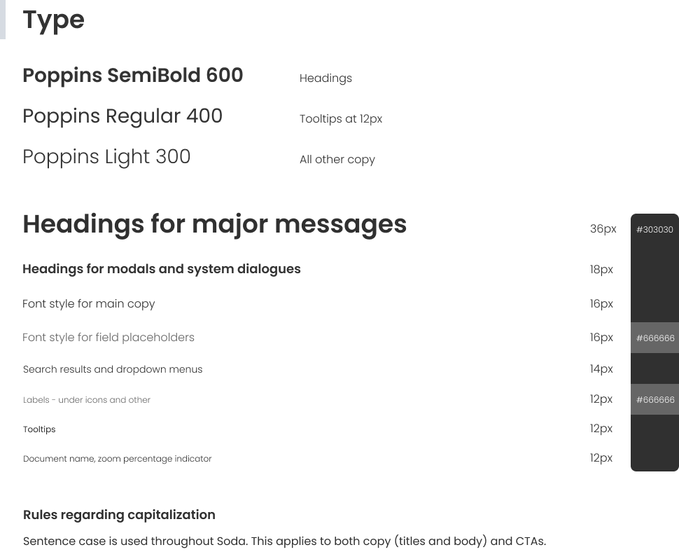
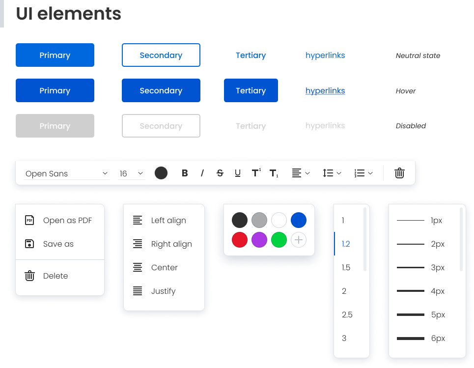
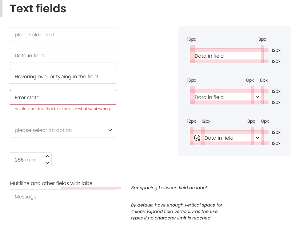
Creating a design system
The redesign presented a prime opportunity to establish a design system to help avoid some of the pitfalls experienced in the past and speed up work in the future.
Making features easier to find
Over the years, Soda PDF had steadily accumulated over 120 features, with quite a few being niche functionality requested by specific clients. That had made parts of the interface somewhat unwieldy, resulting in an experience that could feel overwhelming to new users.
Adding the categories sidebar allowed us to bring out and highlight major services like electronic signatures, cloud storage and translation. It also provided a suitable estate for future PDF-related offerings and cross promotion of the Avanquest ecosystem. At the same time, following the user interviews, certain niche features that were previously attached to other categories were grouped together into a new “specialty” category.
To help the user experience, I designed a new onboarding flow and the team update the product's knowledge base articles. Another element introduced with that aim was evolving the old document search to offer a “feature finding” that helped improve discoverability.

Enhanced search
PDF on mobile
Under the argument of expanding our addressable market, I got the green light to give the app’s mobile experience the long overdue attention it deserved.
An important step of the process was to identify the differences in how clients use PDF on desktop and mobile, and then make sure the new interface accommodated for those needs. To succinctly recap the findings, desktop skewed towards authoring, while mobile tended to be more centered on viewing, signing and filling documents. All the same, the mobile version still needed to provide a well-rounded editing experience. Making sure touch controls were properly utilized was also a big part of that.
Here's an example of what the mobile version looked like in the end.


Combining features
In the previous version of Soda, a lot of document organization operations were handled through pop-up windows where users had have to manually enter page ranges. Those modals would cover the document view, making it necessary that users remember which pages they wanted to move, split, extract, etc. To manage this, many users ended up having to write down the necessary page numbers beforehand, or to open another instance of the document in a separate window. It made for an inconvenient experience, especially when working with larger documents.
To improve that part of the experience, I merged the features for inserting, extracting, and moving pages (as well as for merging and splitting of documents) into a single cohesive interface. The option to manually enter page numbers was still available, but users could now finish the desired task conveniently through a visual representation of their document.


Why I liked this project
Redesigning Soda PDF helped push me further as a designer not just when it came to the technical aspects of the craft, but also in terms of interteam communication and collaboration. The project thought me much about the end-to-end process. It was immensely rewarding to release it successfully and see the reception.
Lessons learned
Involving engineering early in the design process is crucial, especially for complex projects. Asking developers the right questions, is even more so. For example, the initial redesign featured a context-aware floating toolbar that would appear when the user clicked to edit an object in their document. Seeing the initial mockups, developers confirmed that it won't be a problem to create. However, in the later stages of the project, they estimated that it'll take three months of engineering time. This did not fit the planned schedule and the feature had to be axed in favor of a more traditional solution in order to save dev time.
Combining the "what" of quantitative data with the "how" and "why" of qualitative data is key for creating a better product. Overreliance on the quantitative approach was a company culture issue that proved challenging to overcome, but was absolutely worth the effort.
AI can be a great accelerator, when used judiciously. This project was the first time I made major use of AI, notably for parsing, summarizing and synthesis of thousands of support tickets and user feedback from multiple sources. AI also helped with analysing user interview transcripts, enabling quick comparison against my own findings. While that saved a lot of time, I found that it helps to think of AI as an incredibly enthusiastic intern and generally use it under the "trust but verify" principle.